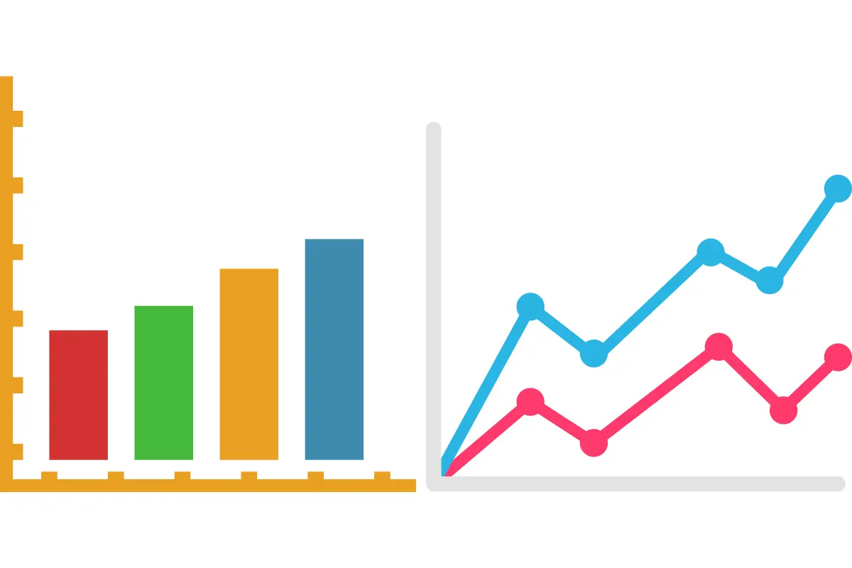
When it comes to visualizing quantitative data, two of the most common options are bar graphs and line graphs. Both allow you to visually convey key information from your dataset, facilitating easy comprehension of trends, relationships, and comparisons. However, bar graphs and line graphs serve somewhat different purposes. Knowing when to use a bar graph vs line graph enables you to pick the option that most effectively communicates insights from your data.
What is a bar graph?
A bar graph utilizes bars to represent data quantities or values across different categories, highlighting the comparative aspect of bar graph vs line graph. When employing a bar graph, the focus is on emphasizing the discrete value of each category, a cornerstone in the bar vs line graph dialogue, facilitating immediate comprehension of comparisons. Moreover, you should also know when to use a bar graph for better use.
Types of bar graphs
Some common types of bar graphs include:
- Vertical bar graphs: Bars extend horizontally from a vertical axis
- Horizontal bar graphs: Bars extend vertically from a horizontal axis
- Grouped or clustered bar graphs: Allow side-by-side comparisons of related values across different sub-categories
Properties of a bar graph
Characterized by discrete bars, bar graphs display categorical data, a distinct advantage in the bar graph vs line graph consideration. This property underscores the clarity and accessibility of bar graphs, making them a standout choice in the bar graph vs line graph debate for conveying complex information straightforwardly.
Advantages of a bar graph
Bar graphs offer several key benefits:
- Allow easy visualization of comparisons across items and categories
- Draw attention to differences between values for distinct items
- Are simple to interpret even for general audiences unfamiliar with statistical visualizations
- Clearly highlight the largest and smallest values in a dataset
What is a line graph?
Line graphs display quantitative values over a specified time interval or continuum of sequential values on the x-axis. They plot data points at regular intervals connected by straight line segments, showing how measurements change in relationship to each other. Ideal for showing data dynamics, the line graph brings a different perspective to the bar graph vs line graph conversation, emphasizing progression and relationship between data points.
Types of line graphs
Some common types include:
- Basic line graphs with a single line
- Comparative line graphs with multiple lines
- Stacked line graphs showing cumulative totals
- 3D line graphs with depth and perspective
Properties of a line graph
Known for displaying continuous data, line graphs add depth to the bar graph vs line graph debate by illustrating trends and rate of change, showcasing their strength in depicting data evolution over time.
Advantages of a line graph
Benefits offered by line graphs include:
- Illustrate trends, trajectories, and rates of change rather than just static values
- Highlight acceleration, deceleration, peaks, troughs, and slope directionality
- Allow extrapolation of likely future data points along trend lines
- Are widely understood by broad audiences already familiar with their conventions
Bar graph vs line graph
While both bar graphs and line graphs serve to visualize quantitative data, there are several key differences:
a. Type of Data
Bar graphs present discrete, often categorized data values and frequencies useful for comparison. Line graphs depict continuous data conveying sequential values at set intervals best for illustrating trends.
b. Comparison and Trends
Bar graphs draw attention to variation across distinct items or categories at a fixed moment. Line graphs highlight trajectories, rates of change, and tendencies unfolding across a timeframe.
c. Presentation of Data
Bars showcase individual quantitative values for different variables. Lines connect sequential coordinated data points, documenting how metrics are evolving in tandem over time or an independent variable.
d. Use of Axes
Bar graph axes present discrete labels representing the distinct categories, topics, or objects each bar references. Line graph axes display a measurement scale documenting continuity from one data point to the next.
Which is better: bar graph or a line graph?
Choosing between a bar graph vs line graph hinges on the nature and storytelling objectives. Bar charts lend themselves to introducing comparisons across separate variables. Line graphs naturally showcase interconnected trends, trajectories, and relationships as they develop chronologically. Think critically regarding what insights you want to convey, and let this guide your design choice.
Conclusion
The bar graph vs line graph decision shapes the narrative of your data, making it crucial to weigh the strengths and contexts of each. When creating data visualizations, considering the key qualities of your dataset can determine whether a bar graph or line graph would be the optimal approach. Bar graphs effectively highlight variation across distinct categories. Line graphs draw attention to trends, rates of change, and evolving interrelationships.
Carefully evaluating what your audience wants to notice and understand makes the difference between selecting the most and least impactful option. By mastering the strengths of each, you can build custom visuals explicitly tailored to the unique character of your data.


![10 Best Bags for Nurses | Personal Recommendation [2023] 4 Best Bags For Nurses Reviews in 2021](https://knowworldnow.com/wp-content/uploads/2022/12/Best-Bags-For-Nurses-Reviews-in-2021.webp)


![F95Zone Games - The Ultimate Guide for 2021 [F95Z Guide] 8 F95Zone Games](https://knowworldnow.com/wp-content/uploads/2021/07/ArTtW5LrK3b-z-0-y-637f48d86203817a9042a857.webp)